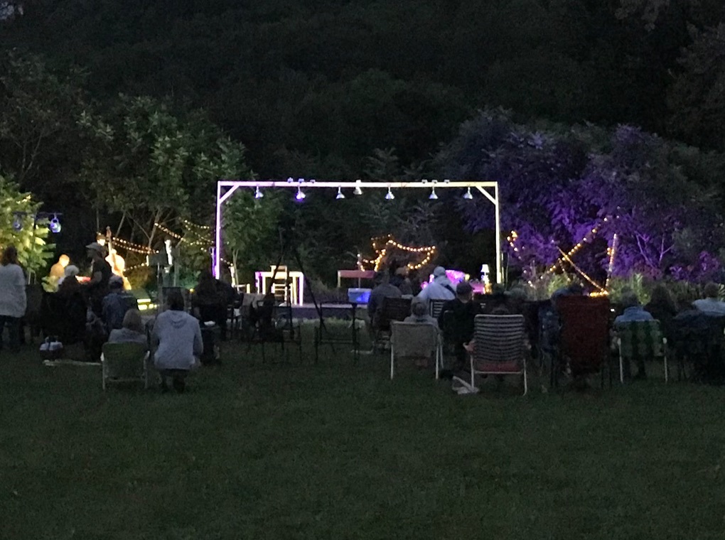
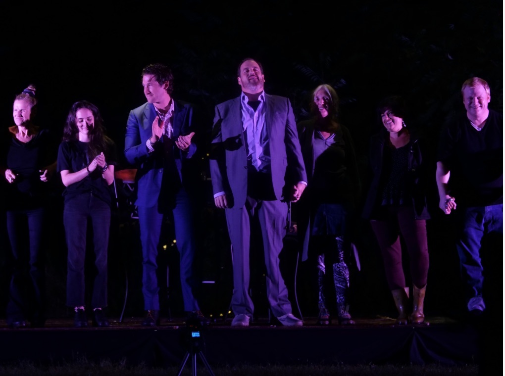
On the other side of the mountain from Dorset and Weston — and their well-heeled Vermont theater festivals — is Rupert, Vermont, population 690. There, Rupert Mountain Theatrefest, a local upstart theatre group with a chip on its shoulder, looked to take on its Green Mountain rivals on a simple plywood stage in a hay field. Thinkso helped the founder articulate his vision for a brand identity that stays true to the town’s straight-shooting philosophy, but embraces the artistry and independent thinking unique to the rural Vermonter. In its second year, the festival doubled its attendance and firmly established itself on the southern Vermont theatre festival map.
“Rupert, Vermont is a peculiar place — and an unlikely location for a theatre festival. But, with Thinkso’s help, we created a brand that boldly reflects the town’s grit and toughness, and also its well-developed appreciation for the arts.” Vance Barton, Executive Director, Rupert Mountain Theatrefest
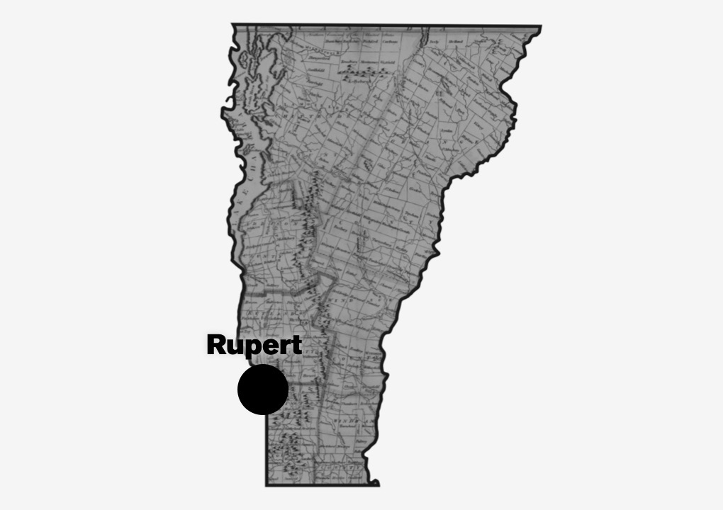
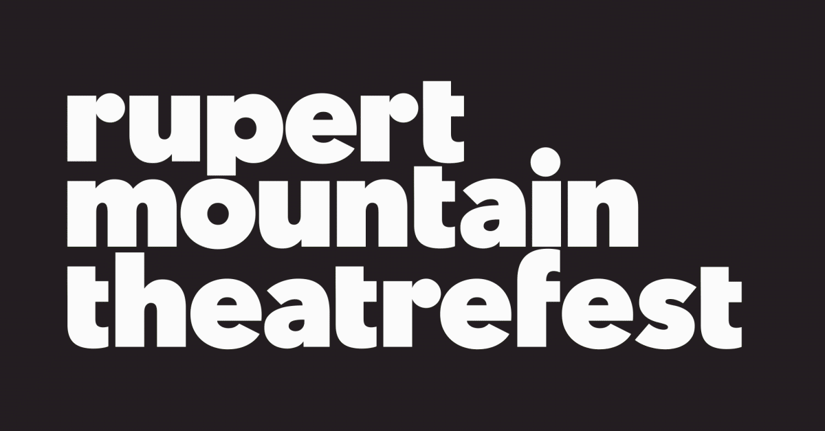
The logotype, a heavy, custom drawn sans-serif set in black and white, is proud and direct, with little design flourishes that set it apart from the ordinary. Inspired by the shape of the location of Rupert within the state of Vermont, a shorthand version of the logo adds a touch of cool and is perfectly suited for event promotion.
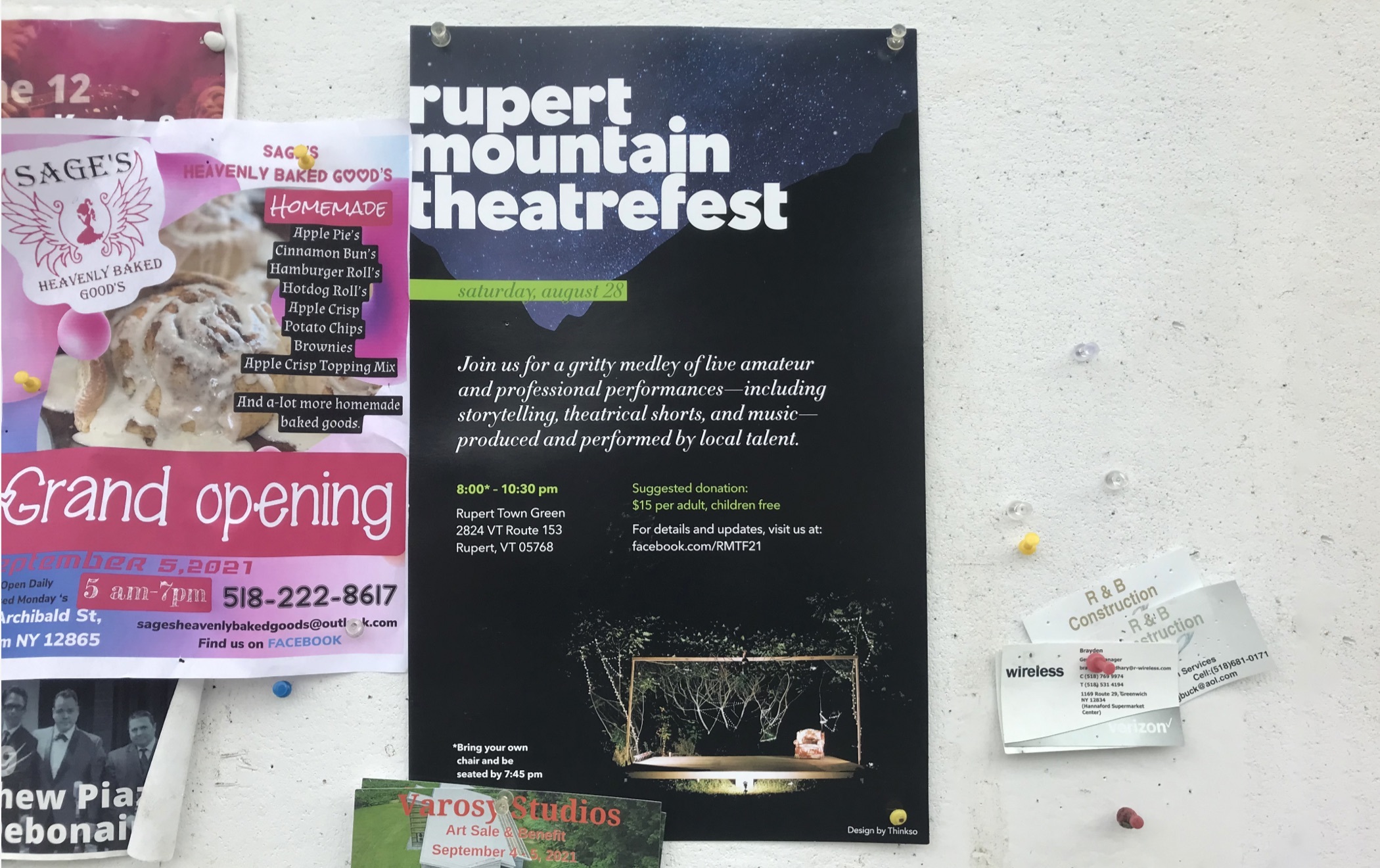
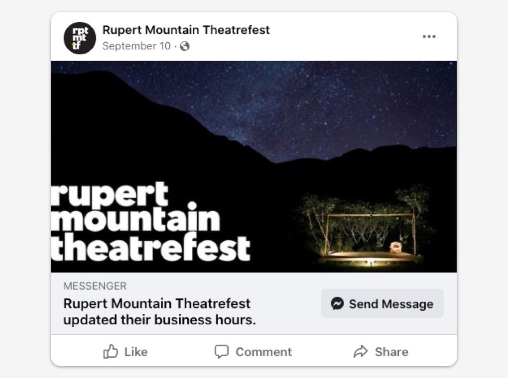
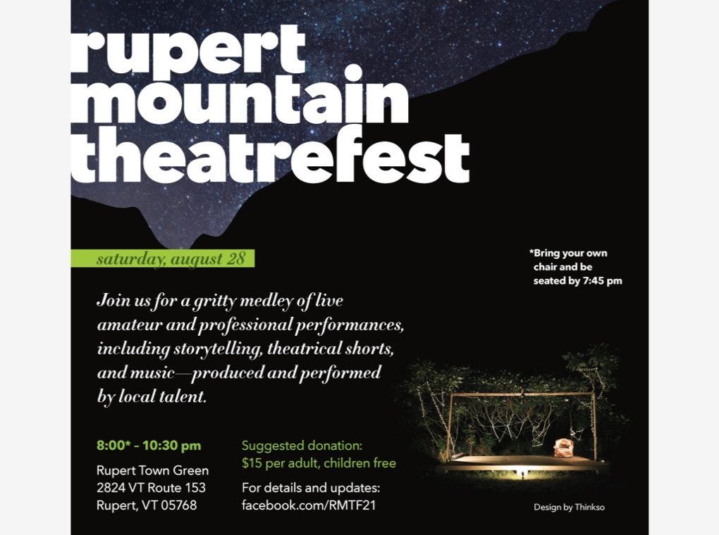
Print ads ran in local newspapers and posters were distributed to surrounding towns. Flyers and stickers were thrown in guerilla-style for good measure, and social media assets were deployed across Facebook and GoFundme to help spread the word and solicit support.
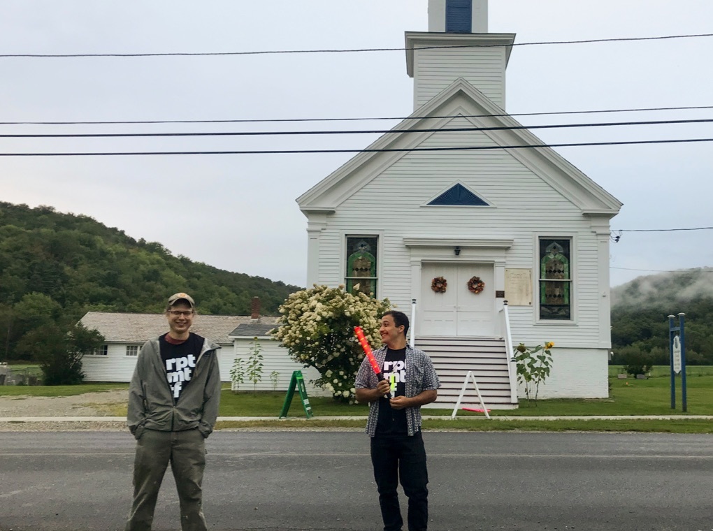
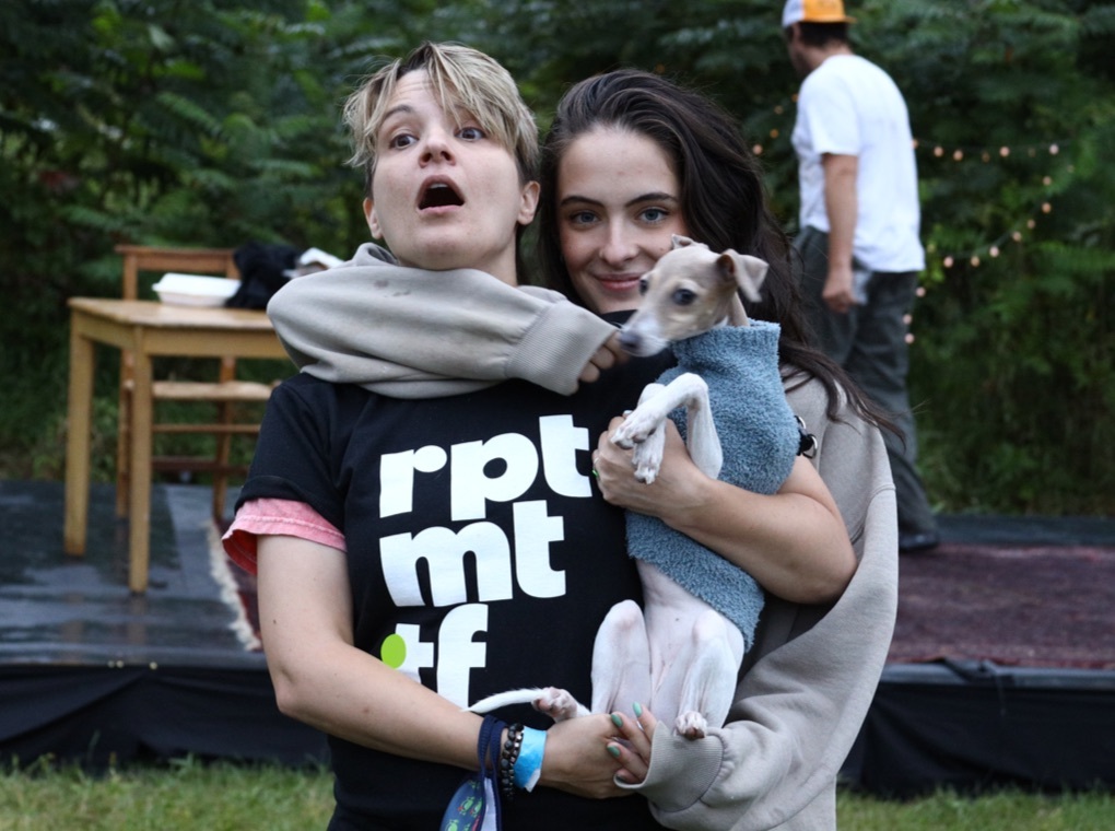
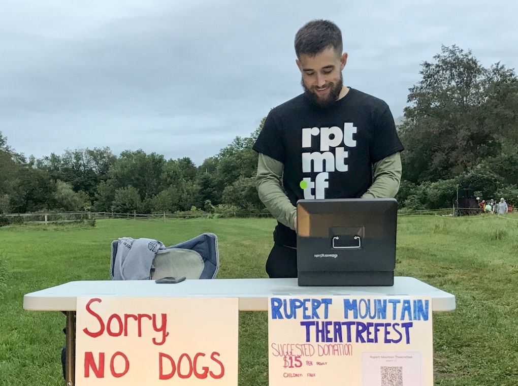
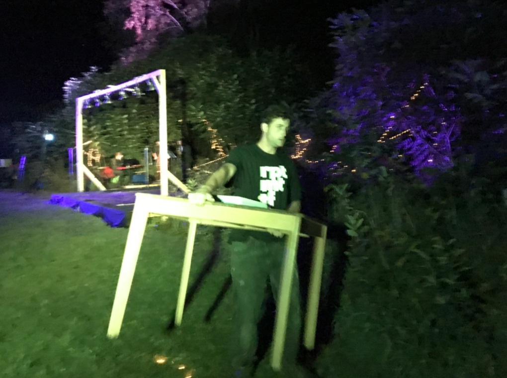
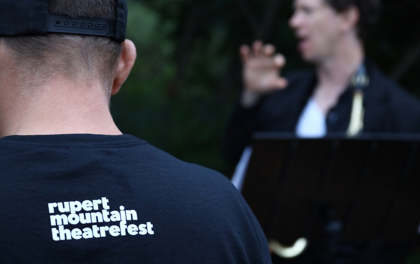
Volunteers and stage hands were outfitted in black T‑shirts emblazoned with the shorthand logo, instantly becoming a coveted item far and wide. Photography by Adam Muro.